
Comfortable office lighting is not simply a matter of adding more lux. Eye strain and visual fatigue are more likely when screens reflect bright sources, luminaires sit in critical sightlines, brightness varies sharply across the room or people cannot adjust the light to suit their task.
What causes visual discomfort in an office?
Direct glare
Bright luminaires or windows sit within the normal field of view.
Reflected glare
Windows and fittings appear as distracting reflections on screens or glossy surfaces.
Harsh contrast
A bright screen, window or task area is surrounded by much darker surfaces.
Poor control
One setting serves different tasks, daylight zones and individual preferences.
The Health and Safety Executive advises that good lighting should suit the task and avoid glare, flicker, shadows and excessive contrast. For display-screen work, the screen, desk, windows, blinds and luminaires must be considered as one visual system.
Position workstations to reduce screen reflections
A practical starting point is to position the screen at right angles to windows where possible. Avoid a bright window directly behind the monitor, which creates strong contrast, and avoid a window behind the user, which can reflect in the screen. Blinds should control troublesome daylight without forcing the room into permanent darkness.
Check reflections from the normal seated position, not only while standing. Glossy screens, glass partitions, polished desks and whiteboards can reveal luminaires that are otherwise outside the direct line of sight.
Use glare-controlled luminaires and a coordinated layout
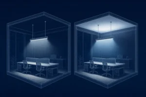
Optics, shielding, luminaire luminance, spacing and viewing direction all influence discomfort glare. A product described as low glare still needs to be tested in the actual room arrangement. For many office tasks, UGR 19 is a common design limit, but it is a calculated installation result rather than a universal property of a fitting.
Rows of luminaires should be coordinated with desk orientation and circulation. The design also needs adequate uniformity and vertical light; simply dimming everything until glare disappears can create a gloomy, high-contrast workspace.
Choose an appropriate colour temperature
Neutral-white lighting is common in offices, but there is no single colour temperature that prevents eye strain. CCT changes the appearance and atmosphere of the room; glare, contrast, flicker, spectral quality, daylight and personal preference also matter.
Keep the colour appearance consistent within a zone. Where tunable-white lighting is used, define a purposeful schedule and allow smooth transitions rather than changing colour temperature for novelty.
Dimming precision and personal control
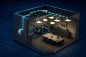
Dimming helps when it follows daylight and task needs, but very coarse steps can cause people to choose between too bright and too dark. Smooth, stable drivers and sensible minimum levels are more useful than a headline dimming range that becomes unstable at low output.
- Zone luminaires parallel to windows so daylight-rich areas can reduce output first.
- Use occupancy control without abrupt switching that distracts nearby workers.
- Provide local adjustment where tasks and preferences vary significantly.
- Commission scenes and time delays after furniture and workstations are in place.
- Check for visible flicker and stroboscopic effects across the intended dimming range.
A practical office comfort checklist
- Map desks, screens, windows and normal viewing directions.
- Review direct and reflected glare from seated eye positions.
- Calculate illuminance, uniformity and UGR for the coordinated layout.
- Balance task light with useful wall and ceiling brightness.
- Specify CCT, colour rendering, flicker performance and controls together.
- Test daylight scenes, blinds and dimming on site.
- Ask users about repeat problem locations after occupation and fine-tune the controls.
Frequently asked questions
What office light colour is easiest on the eyes?
No CCT is universally easiest. A comfortable result comes from controlled brightness, low glare, stable light, suitable task illuminance and a colour appearance appropriate to the room and time of use.
Should an office be brighter than the computer screen?
The aim is balanced brightness rather than a fixed ratio in every setting. Avoid a bright screen in a dark room and avoid intense luminaires or windows close to the line of sight.
Can dimming reduce eye strain?
It can help users match light levels to daylight and the task, provided the system is stable, well zoned and does not introduce flicker or excessively dark surroundings.
Build visual comfort into the lighting plan
Coordinate workstation geometry, glare-controlled luminaires and commissioned controls from the start.
Explore office lightingEstimate office requirementsCompare lighting controls